|
Click on the images to go to their respective web
sites
|
|
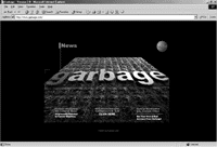 |
This is the official web site to the band Garbage. I really liked the way the site designer used rollovers in order to create a navigation system. I tried to use similar design techniques in order to create rollover effects within my own menu navigation frame. |
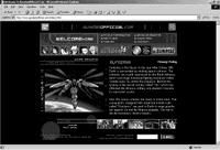
| This is the Official Gundam Wing web site I have found some influence in their usage of rollovers. This web site uses rollovers to better add content to the site. When you roll over the small images of the gundam pilots, you see the Gundams that each one pilots. I used a variant of this in my photographic gallery to display the various photographs as you roll over the names of the specified photographs. |
 |
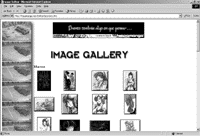 |
From this web page, I liked and adopted the way the publisher of the site presented his gallery icons as buttons to push to get larger images. I incorporated this (and added a rollover to it) in my toys section when I displayed the toys available for view form the toys content page. I like to think that I incorporated this idea into my web site and improved upon it. |
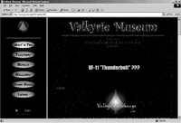
| The Valkyrie Museum is one of the web sites that has influenced my web site in regards to navigation and basic layout. I have adopted part of the button design found in the menu frame of this web site |
 |
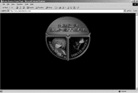 |
This round menu system on the Media Blasters site is what inspired my to create the image map on the main content page. After seeing this map I wanted to replicate the functionality of this guiding device. Thus I created the navigation circle that leads to my sections involving Anime, Toys, Photography, and Elementz. |
| Another influence without a web site: |
There was one other major influence on the design of
my web site not presented above. This influence comes from an old site
I have only recently discovered to have been taken down off of the Internet.
The Republica band we site has been removed from the Internet and it
was responsible for many of the color layouts and some basic web designs
that I have incorporated into my own web site
|
My perspective on the design of this web site:
I would like to start my analysis of my own web site by talking about the color scheme. Throughout the entire web site I tried to use the same color scheme so that the site feel like one cohesive unit. To accomplish this, I used simple, similar colors in order help well define what piece of the site is what in relation to everything else on the site. To accomplish this effect I used some colors I liked and thought helped distinguish what everything is on the site. In the end, I think this color scheme used throughout the entire site helps to bind it together.
My next big effort in trying to create a single cohesive web site was by using similarly designed buttons. Throughout the entire web site I predominantly use the same buttons, or the same type of buttons in order to keep things simple and coherent. I added the simple rollover effect to each button in order to make the site seem like it is more interactive to the user. One of my only concerns with using so many rollover is that I was afraid it might slow the site down. However, for people using a high speed connection, this is not a problem. By adding the rollover buttons, I feel that I have helped make the site more interactive and user friendly.
Another one of my design aspects which is designed to help people navigate to where they want to go is the image map on the main page. I created this image map so that people could easily find their way to the sections the user might find of interest. I hope that this image map helps make the site design at least a little more efficient from the main page. Instead of just getting a text based information source about what is in each section, I have tried to provide a visual guide for a user to use in order to expedite and enhance their viewing experience of this web site
I also tried to use multiple event rollovers in order to economize on space in the Toys section and Photography section. I used this swapping technique in order to conserve on space so that the user did not have to have an absolutely huge window open in order to view everything at once. By using this technique, I feel that I have been able to keep some aspects of this site in check and preventing them from becoming unwieldy. The more compact a site can be, the easier it is for a user to navigate around and enjoy the content provided within the site.
I also decided to use frames on my site design in order to enhance the user's experience. By including frames, a user is not required to continually fish for how to navigate around the site. Rather, the navigation tools are always available to the user and thus makes navigating around the site very easy without the user having to worry about how deep into the site he goes or how far away he goes from the main page. With the navigation bar, it is always quick and easy to get where the user desires to go. However, if a user so desires it, I have designed this site to operate without frames. The only that would be missing without the frames would be the banner provided in the top frame of this web site.